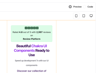
Beautiful Chakra UI Components
Ready to Use
Speed up development 7x with our UI components
Discover our collection of professionally designed, fully responsive, and expertly crafted components built with Chakra UI. Perfect for your next project.
20+ web pages powered by 5+ plug and play components
Step 1:
Start your SaaS project
Step 2:
Access our library of components
All components include:
- 100% customizable
- 100% responsive
- 100% accessible
Every package includes:
- Free updates for life
- No hidden fees
- 100% money-back guarantee
How our UI Components Help You Build Better Products
Our components are designed to help you build better products faster. They are fully customizable, responsive, and accessible.
Building from Scratch
1. Time-Consuming Setup
Weeks spent configuring components, themes, and project structure
2. Inconsistent Design
Struggle with maintaining visual consistency and responsive behavior
3. Technical Debt
Missing accessibility features and poor code organization
With Chakra Blocks
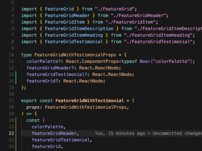
1. Pre-built Components
Start with 30+ production-ready components designed for common use cases
2. Rapid Development
Launch faster with pre-configured Chakra UI themes and responsive layouts
3. Best Practices Built-in
Accessibility, TypeScript, and modern React patterns come standard
Speed up dev time 7x
✨ Build faster with pre-built Chakra UI components
Ship Production-Ready UIs in Minutes
Access 30+ production-ready components designed for common use cases. Copy, paste, and customize to match your brand.
Kevin Peters
Saves so much development time
Realizing this landing page is built with these very components? Yeah, we're eating our own dog food. Pretty meta, right?
Date of experience: January 31, 2026
Responsive Layouts
Every component is built mobile-first with responsive breakpoints. Works beautifully on all screen sizes.
Copy & Customize
Grab the code and tweak it to match your design system. Built with Chakra UI primitives.
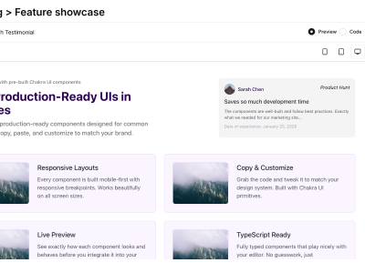
Live Preview
See exactly how each component looks and behaves before you integrate it into your project.
TypeScript Ready
Fully typed components that play nicely with your editor. No guesswork, just autocomplete.
Got questions? We've got answers.
Frequently Asked Questions
Common questions about Chakra Blocks and our pre-built component library.
Over 500 professionally designed components—from buttons and inputs to data tables and modals. All built with Chakra UI and fully customizable.
Yes! A commercial license comes with every purchase. Use them in personal projects, client work, or products —no project limits.
Everything runs on Chakra UI v3 with current React patterns and best practices.
Yes. Every component is mobile-first with responsive breakpoints. Works on phones, tablets, and desktops.
Yes. Components use Chakra color tokens and adapt automatically when your app switches themes.
Absolutely. You get full source code. Adjust colors, spacing, and copy to match your design system.
Yes. All components are typed with proper interfaces. Full autocomplete and type safety in your editor.
Purchasers receive updates and new components. We add blocks and refine existing ones based on feedback.
Yes. We offer support via our Discord community for implementation help, customization tips, and best practices.
Perpetual license—pay once, use forever. No recurring fees.
Ready to build? Join thousands of developers already shipping.
Ready to Get Started?
Components You Can Trust
Not happy? We'll refund your purchase, no questions asked.
Full Ownership
You own the code. Use it in any project: personal, client, or commercial.
No Subscriptions
Pay once, use forever. No recurring fees. Your license never expires.